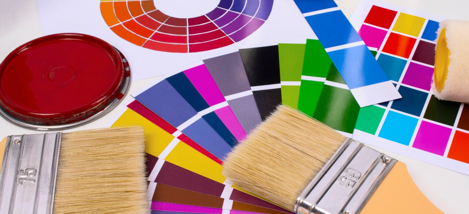
Color accuracy can make or break a printed product. Whether you’re custom apparel printing, packaging, or branded merchandise, consistency across screens, proofs, and final prints matters more than most people realize. That’s where Pantone color guides come in, and more specifically, the Pantone Color Bridge Guide.
If you’ve ever wondered what a Pantone Color Bridge is, how it differs from other Pantone guides, or when you should use it in printing, this guide will walk you through everything you need to know.
What Is Pantone in Printing?
Pantone is a globally recognized color matching system that helps designers, printers, and manufacturers communicate color accurately. Instead of relying on subjective descriptions like “deep blue” or “warm red,” Pantone assigns each color a standardized number within the Pantone Matching System (PMS).
A Pantone PMS color guide ensures that a color chosen by a designer looks the same when printed, no matter where or how it’s produced.
Pantone color guides are widely used in:
- Screen printing
- Offset and digital printing
- Packaging and product manufacturing
- Fashion and apparel branding
What Is a Pantone Color Bridge?
Pantone Color Bridge is a Pantone color guide that shows how Pantone spot colors (PMS) translate when printed using CMYK four-color process printing
In simple terms, it bridges the gap between:
- Pantone spot colors (PMS)
- CMYK process colors
Each page in the guide displays:
- The original Pantone spot color
- The closest CMYK equivalent printed side by side
This allows designers and printers to see how a Pantone color will look when it cannot be printed as a spot color.
What the Pantone Color Bridge Does
- Displays each Pantone PMS color alongside its closest CMYK equivalent
- Helps predict color shifts between spot-color and process printing
- Bridges the gap between design intent and real print output
- Supports consistent color decisions across different printing methods
For apparel screen printing and merchandising, this is especially important when designs move between digital mockups, proofs, and final garments.
Why It’s Important
Not all printing jobs use Pantone spot inks. Digital printing, offset printing, and some apparel methods rely on CMYK. The Pantone Color Bridge lets you:
- Decide whether CMYK is acceptable or if spot ink is needed
- Avoid surprises in final prints
- Maintain brand color consistency across materials and vendors
Pantone Color Bridge vs Formula Guide: What’s the Difference?
Pantone Color Formula Guide
- Shows solid Pantone PMS spot colors only
- Includes ink mixing formulas
- Used when printing with actual Pantone inks
- Ideal for screen printing and spot-color jobs
Pantone Color Bridge Guide
- Shows Pantone spot color next to CMYK equivalent
- Designed for process printing
- Helps compare accuracy and color loss
- Ideal for digital, offset, and hybrid workflows
In short:
- Use the Pantone color bridge guide when converting PMS colors to CMYK
- Use the Pantone color formula guide when you plan to print with spot colors
When to Use Pantone Color Bridge
- When converting designs from Pantone to CMYK
- When printing digitally or using four-color process
- When approving proofs for color accuracy
- When managing brand colors across multiple print methods
Pantone Color Bridge Guide Coated vs Uncoated
Pantone Color Bridge Guide Coated
- Designed for glossy or coated paper
- Colors appear more vibrant
- Commonly used for packaging, marketing materials, and labels
Pantone Color Bridge Guide Uncoated
Designed for matte or uncoated paper
- Colors appear softer and more muted
- Used for stationery, books, and natural-finish materials
Choosing the right version ensures more accurate color expectations during printing.
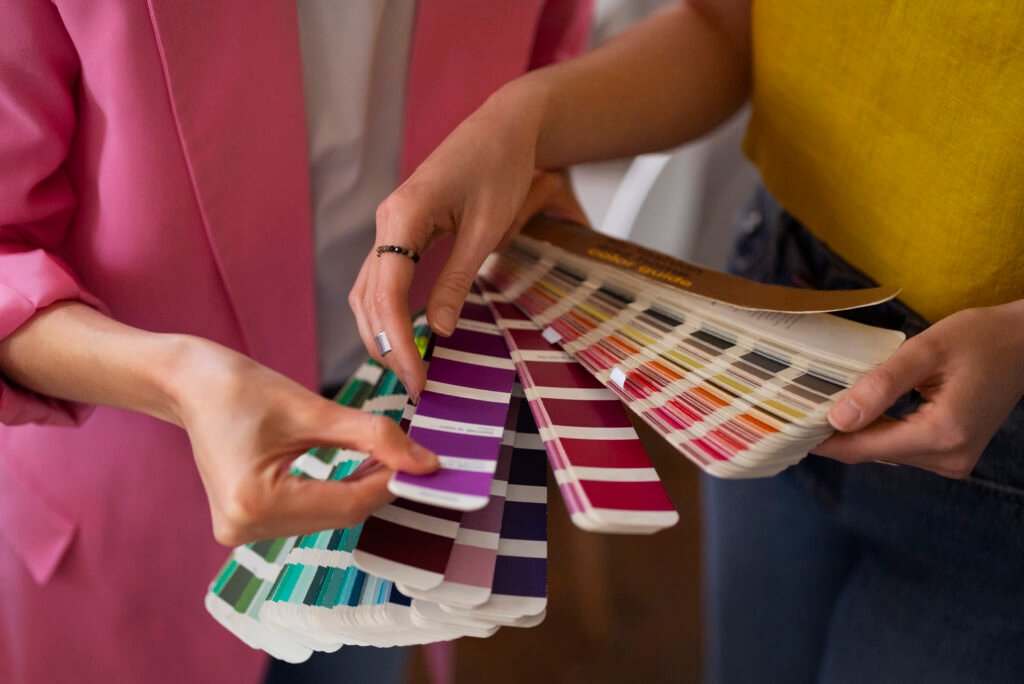
Pantone Color Guides Explained
Here’s how the main Pantone colors guide options differ:
- Pantone Color Formula Guide
Spot colors with ink formulas - Pantone Color Bridge Guide
PMS colors compared to CMYK equivalents - Pantone 4 Color Process Guide
CMYK-only color selections - Pantone Color Matching Guide
Helps match physical samples to Pantone references
Each Pantone color guide book serves a different purpose, and professional printers often use more than one.
Pantone Color Guide Online vs Physical Books
Many designers search for a Pantone color guide online or a Pantone color guide PDF. While digital references are helpful for early design stages, they have limitations.
Online or PDF Guides
- Useful for quick reference
- Not color-accurate across screens
- Affected by monitor calibration
Physical Pantone Color Guidebooks
- Printed with certified inks
- Show true color under real lighting
- Essential for professional printing
For production decisions, physical guides are always more reliable than digital versions.
Pantone Color Bridge Guide Set: Who Should Use It?
A Pantone Color Bridge Guide Set typically includes coated and uncoated versions. It’s best suited for:
- Professional designers
- Print shops and manufacturers
- Apparel and merchandise brands
- Marketing teams managing brand colors
If your brand prints across multiple materials and methods, the guide set helps maintain consistency.
How Pantone Color Bridge Is Used in Apparel Printing
In apparel printing, Pantone Color Bridge is commonly used when:
- Artwork is designed in Pantone but printed digitally
- Designs move between DTG, DTF, and screen printing
- CMYK mockups need approval before production
It allows printers to advise clients on potential color differences and recommend the best printing method for accuracy.
Common Mistakes to Avoid When Using Pantone Guides
- Assuming CMYK will perfectly match PMS
- Relying only on online Pantone references
- Ignoring paper or fabric type
- Not checking coated vs uncoated guides
- Skipping print tests for critical brand colors
- Using the right Pantone color matching guide helps avoid costly reprints and disappointment.
Final Thoughts
If color accuracy matters to your brand, the answer is yes. The Pantone Color Bridge Guide is an essential tool for anyone working between spot colors and CMYK printing. It provides clarity, sets expectations, and protects brand consistency.
Whether you’re choosing inks for apparel, packaging, or promotional materials, understanding how Pantone colors translate into real-world printing gives you better control over the final result.
At MLXL, color accuracy is part of quality. Our team works with professional Pantone color guides to ensure your designs look exactly how they’re meant to, from proof to final print.
Need Help Matching Colors for Your Print Project?
Not sure how your Pantone colors will translate to print? That’s where experience makes the difference. At MLXL, our print specialists work hands-on with your designs to ensure color accuracy from proof to final production.
Your brand’s next great piece of apparel starts here.